Hi all!
I’ve been neglecting my blog and my flash fiction challenges lately, because I’ve been finishing my third novel, Midsummer at Eyre Hall, which is also the final instalment of The Eyre Hall Trilogy, which is due to be published on 21st June, Midsummer’s Day!
I’ve asked the person who designed the first two novels to design the third, and I’m afraid I’m confused. I don’t know which one I like. I don’t even know if I like any of them, and I was wondering if you could help me choose or change.
Just to let you know, the title refers to the final chapter where there is a reunion in summer at Eyre Hall. The novel has many dramatic moments, although the ending is mostly optimistic, but not for all the characters. I wanted to transmit tranquility and closure on a bright summer’s day.
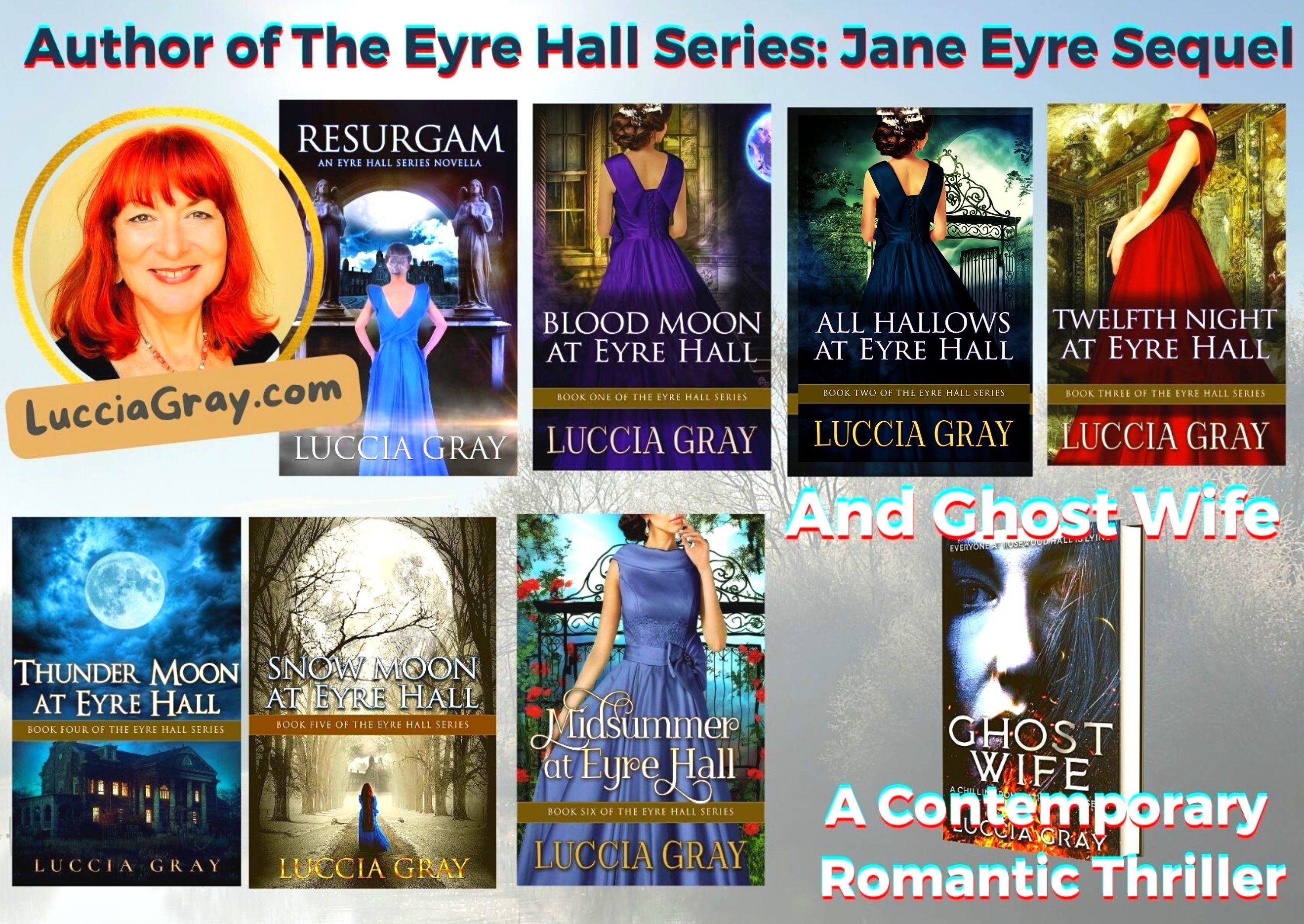
Check out the covers for my first two novels on the right to compare.
I asked for a similar style using the same/similar model.
It’s the designer’s first suggestion, so there will be more based on my feedback.
Here are the initial covers:

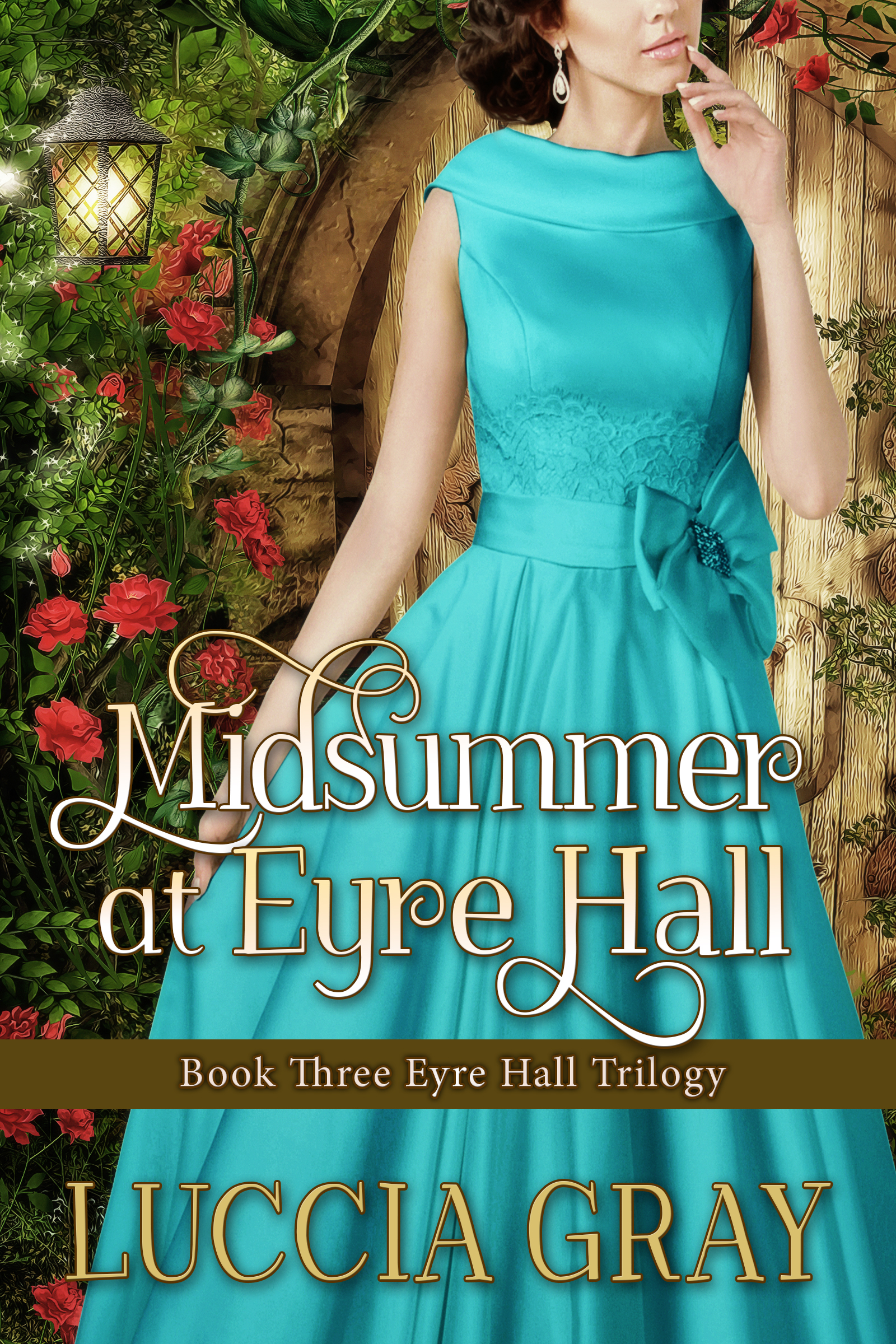
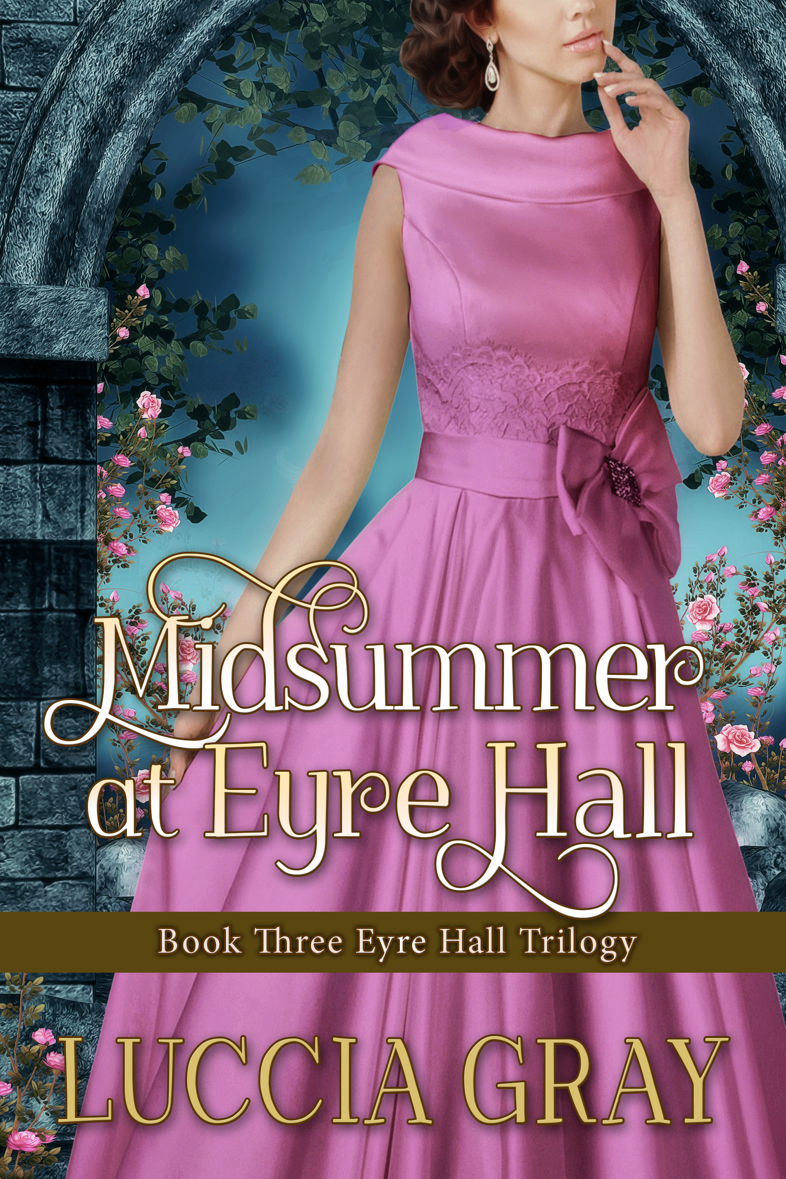
What do you think?
Thank you for your help!
Hope you have a great Easter break 🙂

Is the dress design correct for the era the book is written in?
LikeLiked by 3 people
You’re probably right, Rosie. That’s one of the things I wasn’t too sure about. Although some people have also suggested the first two covers look too modern, too. Thanks for your comment.
LikeLike
I like the picking up of the gate from All hallows in image one but I would like slightly more greenery in the top left corner as the white space draws the eye a little too much I feel.
LikeLiked by 1 person
I agree, Linda. I don’t like the white space either. Quite a few people like the gate image too. Do you like the colour of the dress? I thought thre were too many colours in this cover.
LikeLiked by 1 person
I love the colour of the dress. I didn’t like the pink – thought it undermined the writing and made it seem too superficial.
LikeLiked by 1 person
Glad you liked the blue. I’ve asked the designer to try with a more steel blue. I thought the turquoise
LikeLiked by 1 person
Was too youthful. The story moves on 10 years. Jane is in her early 50s
LikeLiked by 1 person
Hi Luccia I think the colours in cover 2 say midsummer to me the best. I wondered if it wasn’t too late to ask your cover designer to give your heroine a dress and hairstyle from the period. I think book one and two work ok in that respect but book three looks rather like 1950s, attending the Oscars, especially as the woman is now facing front. Which do you prefer?
LikeLiked by 1 person
You’re right about the dress, it’s more Audrey Hepburn then Jane Eyre 🙂
For me there’s something wrong with all of them! I don’t like the door in two. It looks like a cottage, and Eyre Hall is a grand estate house. I don’t like the colours of the dresses or the spaces in the background of 1 and 3. I like the stone arch, but not the dress or the space at the back. I’m in a mess, as you can see!
Thanks for commenting 🙂
LikeLiked by 1 person
I agree with the comments about the dress. I like the arch in the last one but not sure the colour is right for midsummer.
LikeLiked by 1 person
I chose 1 because of the gate. The wooden door looked too cottagey and the stone arch looked too Thomas Kincaidy 🙂
LikeLiked by 1 person
Thank you, Mary. Most people seem to like the gate.
LikeLike
I like the second cover. But I’m not in love with the wooden door! But the color of the dress is beautiful!
LikeLiked by 1 person
Thank you.💗 I agree the wooden door isn’t right.
LikeLike
The one with the door is beautiful, but it reminds me of a hobbit hole… I’d probably expect it to have fantasy elements. The one with the stone arch is my favorite background– but made me think something was wrong with the dress– maybe I don’t like the pink version of the dress or maybe the styles looks too 1960’s, not sure. For those reasons, I chose the iron gate. It’s a really nice cover and everything seems to go well together
LikeLiked by 1 person
Thank you so much amber💗
LikeLike
I loved the pink dress pix 🙂
Good luck and can’t wait to read it!
xoxo
LikeLiked by 1 person
Thank you.💗
LikeLike
Since it’s summer, I would maybe go for a yellow or orange dress. I think those colors would work better with the other two covers as well.
LikeLiked by 1 person
Thank you, Ula💗 I thought about yellow too.
LikeLike
I like the gate background the most out off the 3 but I would change the dress and the color – yellow or maybe a print like Scarlett O’hara’s white and green picnic dress from Gone with the Wind – would give a more summertime feel. I’m so looking forward to this book!
LikeLiked by 1 person
Thank you, Susan💗
LikeLike
Ok I’ve said the second one but I actually I think a deep green dress would look fantastic against the other two covers I prefer a filled in background rather than the white in the gate one. Hope that is of some help
LikeLiked by 1 person
Yes, Mary 💗 I agree about the filled background. The thing is the first two are stunning and the third is still on it’s way…
LikeLike
how about a more period style dress in ivory. some flower and use the gate also a more period style hair style. i cannot wait.
LikeLike
Thank you, Joyce. I wanted white or ivory, but my designer says it wouldn’t look good with the font colour for the title. I know the model doesn’t look Victorian enough, but it’s the same one in the three books. Thank you for commenting!
LikeLike
Hmm. I voted but I’m not sure. I absolutely LOVE your first 2 covers. The dress style doesn’t grab me for your series and the color doesn’t seem to flow with the dark blue and red of the others. (I adore turquoise but it seems off here.) Maybe a yellow or green? 💚
LikeLiked by 1 person
Thank you, Sarah. I’ve tried some more colours with my designer, nearly there! I’ll be posting it soon!
LikeLiked by 1 person